12.5 条形图
条形图特别适合分类变量的展示,我们这里展示钻石切割质量 cut 不同等级的数量,当然我们可以直接展示各类的数目,在图层 geom_bar 中指定 stat="identity"
# 需要映射数据框的两个变量,相当于自己先计算了每类的数量
with(diamonds, table(cut))
## cut
## Fair Good Very Good Premium Ideal
## 1610 4906 12082 13791 21551cut_df <- as.data.frame(table(diamonds$cut))
ggplot(cut_df, aes(x = Var1, y = Freq)) + geom_bar(stat = "identity")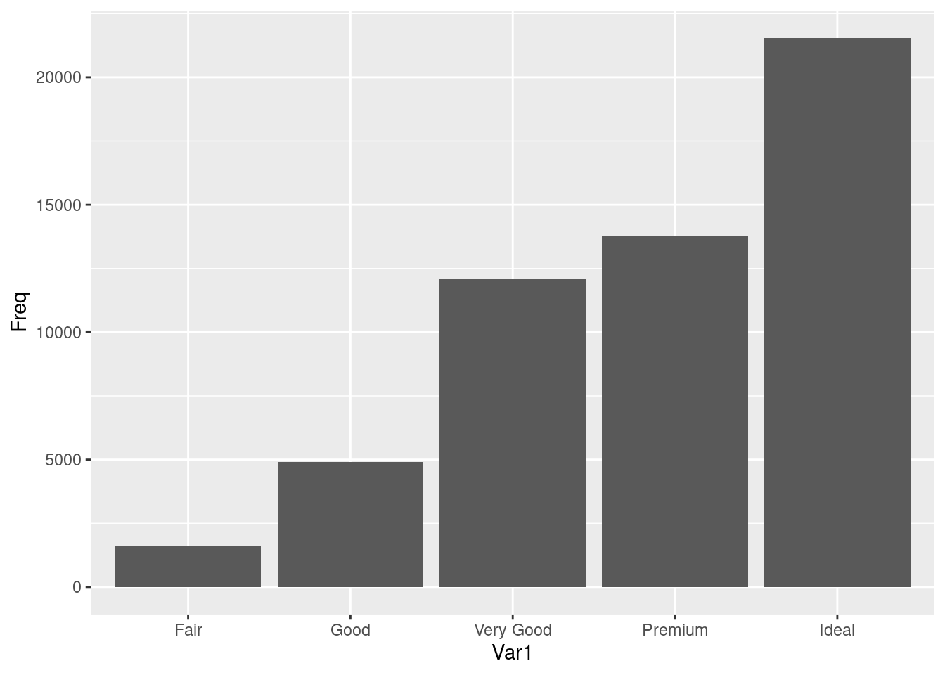
ggplot(diamonds, aes(x = cut)) + geom_bar()
图 12.23: 频数条形图
还有另外三种表示方法
ggplot(diamonds, aes(x = cut)) + geom_bar(stat = "count")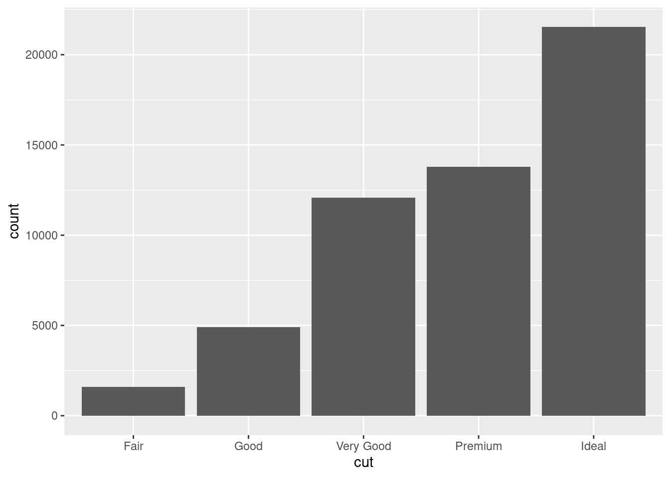
ggplot(diamonds, aes(x = cut, y = ..count..)) + geom_bar()## Warning: The dot-dot notation (`..count..`) was deprecated in ggplot2 3.4.0.
## ℹ Please use `after_stat(count)` instead.
## This warning is displayed once every 8 hours.
## Call `lifecycle::last_lifecycle_warnings()` to see where this warning was
## generated.
ggplot(diamonds, aes(x = cut, y = stat(count))) + geom_bar()## Warning: `stat(count)` was deprecated in ggplot2 3.4.0.
## ℹ Please use `after_stat(count)` instead.
## This warning is displayed once every 8 hours.
## Call `lifecycle::last_lifecycle_warnings()` to see where this warning was
## generated.
我们还可以在图 12.23 的基础上再添加一个分类变量钻石的纯净度 clarity,形成堆积条形图
ggplot(diamonds, aes(x = cut, fill = clarity)) + geom_bar()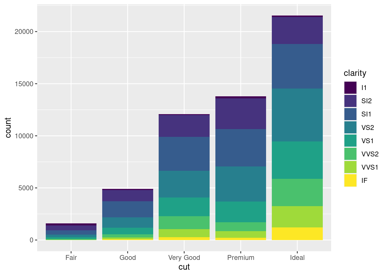
图 12.24: 堆积条形图
再添加一个分类变量钻石颜色 color 比较好的做法是分面
ggplot(diamonds, aes(x = color, fill = clarity)) +
  geom_bar() +
  facet_grid(~cut)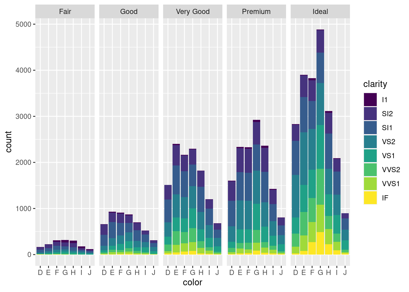
图 12.25: 分面堆积条形图
实际上,绘制图12.25包含了对分类变量的分组计数过程,如下
with(diamonds, table(cut, color))## color
## cut D E F G H I J
## Fair 163 224 312 314 303 175 119
## Good 662 933 909 871 702 522 307
## Very Good 1513 2400 2164 2299 1824 1204 678
## Premium 1603 2337 2331 2924 2360 1428 808
## Ideal 2834 3903 3826 4884 3115 2093 896还有一种堆积的方法是按比例,而不是按数量,如图12.26
ggplot(diamonds, aes(x = color, fill = clarity)) +
  geom_bar(position = "fill") +
  facet_grid(~cut)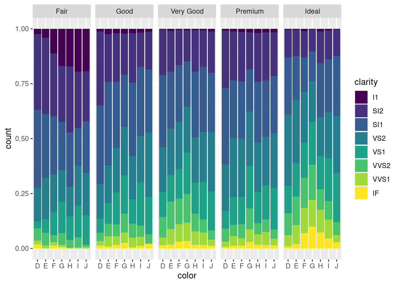
图 12.26: 比例堆积条形图
接下来就是复合条形图
ggplot(diamonds, aes(x = color, fill = clarity)) +
  geom_bar(position = "dodge")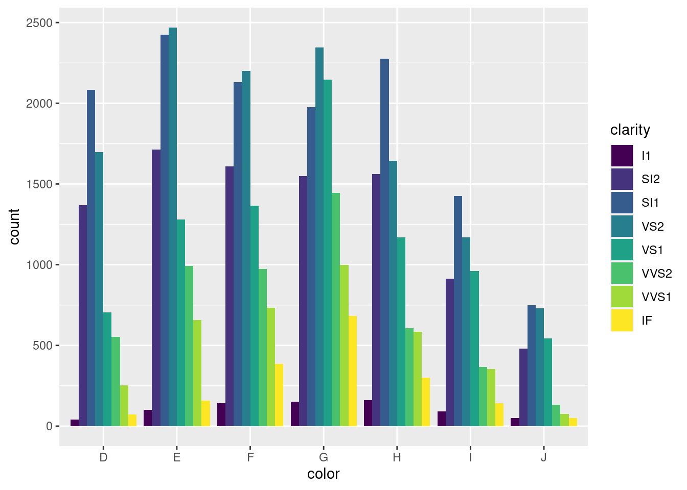
图 12.27: 复合条形图
再添加一个分类变量,就是需要分面大法了,图 12.27 展示了三个分类变量,其实我们还可以再添加一个分类变量用作分面的列依据
ggplot(diamonds, aes(x = color, fill = clarity)) +
  geom_bar(position = "dodge") +
  facet_grid(rows = vars(cut))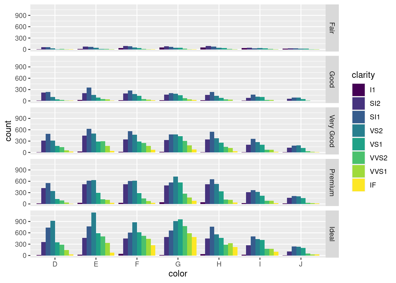
图 12.28: 分面复合条形图
图 12.28 展示的数据如下
with(diamonds, table(color, clarity, cut))## , , cut = Fair
##
## clarity
## color I1 SI2 SI1 VS2 VS1 VVS2 VVS1 IF
## D 4 56 58 25 5 9 3 3
## E 9 78 65 42 14 13 3 0
## F 35 89 83 53 33 10 5 4
## G 53 80 69 45 45 17 3 2
## H 52 91 75 41 32 11 1 0
## I 34 45 30 32 25 8 1 0
## J 23 27 28 23 16 1 1 0
##
## , , cut = Good
##
## clarity
## color I1 SI2 SI1 VS2 VS1 VVS2 VVS1 IF
## D 8 223 237 104 43 25 13 9
## E 23 202 355 160 89 52 43 9
## F 19 201 273 184 132 50 35 15
## G 19 163 207 192 152 75 41 22
## H 14 158 235 138 77 45 31 4
## I 9 81 165 110 103 26 22 6
## J 4 53 88 90 52 13 1 6
##
## , , cut = Very Good
##
## clarity
## color I1 SI2 SI1 VS2 VS1 VVS2 VVS1 IF
## D 5 314 494 309 175 141 52 23
## E 22 445 626 503 293 298 170 43
## F 13 343 559 466 293 249 174 67
## G 16 327 474 479 432 302 190 79
## H 12 343 547 376 257 145 115 29
## I 8 200 358 274 205 71 69 19
## J 8 128 182 184 120 29 19 8
##
## , , cut = Premium
##
## clarity
## color I1 SI2 SI1 VS2 VS1 VVS2 VVS1 IF
## D 12 421 556 339 131 94 40 10
## E 30 519 614 629 292 121 105 27
## F 34 523 608 619 290 146 80 31
## G 46 492 566 721 566 275 171 87
## H 46 521 655 532 336 118 112 40
## I 24 312 367 315 221 82 84 23
## J 13 161 209 202 153 34 24 12
##
## , , cut = Ideal
##
## clarity
## color I1 SI2 SI1 VS2 VS1 VVS2 VVS1 IF
## D 13 356 738 920 351 284 144 28
## E 18 469 766 1136 593 507 335 79
## F 42 453 608 879 616 520 440 268
## G 16 486 660 910 953 774 594 491
## H 38 450 763 556 467 289 326 226
## I 17 274 504 438 408 178 179 95
## J 2 110 243 232 201 54 29 25# 漫谈条形图 https://cosx.org/2017/10/discussion-about-bar-graph
set.seed(2020)
dat <- data.frame(
age = rep(1:30, 2),
gender = rep(c("man", "woman"), each = 30),
num = sample(x = 1:100, size = 60, replace = T)
)
# 重叠
p1 <- ggplot(data = dat, aes(x = age, y = num, fill = gender)) +
geom_col(position = "identity", alpha = 0.5)
# 堆积
p2 <- ggplot(data = dat, aes(x = age, y = num, fill = gender)) +
geom_col(position = "stack")
# 双柱
p3 <- ggplot(data = dat, aes(x = age, y = num, fill = gender)) +
geom_col(position = "dodge")
# 百分比
p4 <- ggplot(data = dat, aes(x = age, y = num, fill = gender)) +
geom_col(position = "fill") +
scale_y_continuous(labels = scales::percent_format()) +
labs(y = "%")
(p1 + p2) / (p3 + p4)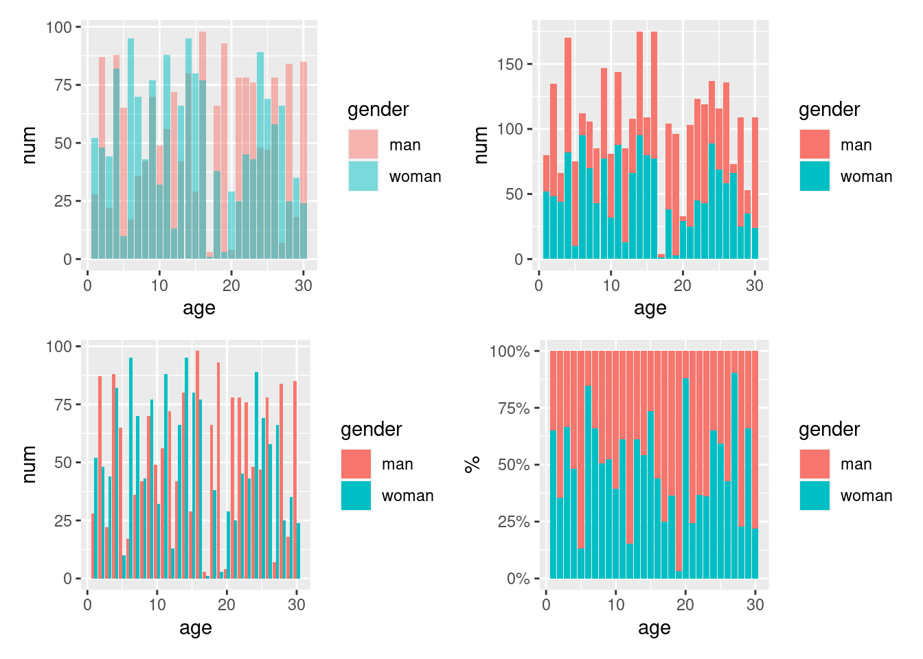
图 12.29: 条形图的四种常见形态
以数据集 diamonds 为例,按照纯净度 clarity 和切工 cut 分组统计钻石的数量,再按切工分组统计不同纯净度的钻石数量占比,如表 12.1 所示
library(data.table)
diamonds <- as.data.table(diamonds)
dat <- diamonds[, .(cnt = .N), by = .(cut, clarity)] %>%
  .[, pct := cnt / sum(cnt), by = .(cut)] %>%
  .[, pct_pp := paste0(cnt, " (", scales::percent(pct, accuracy = 0.01), ")") ]
# 分组计数 with(diamonds, table(clarity, cut))
dcast(dat, formula = clarity ~ cut, value.var = "pct_pp") %>%
knitr::kable(align = "crrrrr", caption = "数值和比例组合呈现")| clarity | Fair | Good | Very Good | Premium | Ideal |
|---|---|---|---|---|---|
| I1 | 210 (13.04%) | 96 (1.96%) | 84 (0.70%) | 205 (1.49%) | 146 (0.68%) |
| SI2 | 466 (28.94%) | 1081 (22.03%) | 2100 (17.38%) | 2949 (21.38%) | 2598 (12.06%) |
| SI1 | 408 (25.34%) | 1560 (31.80%) | 3240 (26.82%) | 3575 (25.92%) | 4282 (19.87%) |
| VS2 | 261 (16.21%) | 978 (19.93%) | 2591 (21.45%) | 3357 (24.34%) | 5071 (23.53%) |
| VS1 | 170 (10.56%) | 648 (13.21%) | 1775 (14.69%) | 1989 (14.42%) | 3589 (16.65%) |
| VVS2 | 69 (4.29%) | 286 (5.83%) | 1235 (10.22%) | 870 (6.31%) | 2606 (12.09%) |
| VVS1 | 17 (1.06%) | 186 (3.79%) | 789 (6.53%) | 616 (4.47%) | 2047 (9.50%) |
| IF | 9 (0.56%) | 71 (1.45%) | 268 (2.22%) | 230 (1.67%) | 1212 (5.62%) |
分别以堆积条形图和百分比堆积条形图展示,添加注释到条形图上,见 12.30
p1 = ggplot(data = dat, aes(x = cut, y = cnt, fill = clarity)) +
  geom_col(position = "dodge") +
  geom_text(aes(label = cnt), position = position_dodge(1), vjust = -0.5) +
  geom_text(aes(label = scales::percent(pct, accuracy = 0.1)),
    position = position_dodge(1), vjust = 1, hjust = 0.5
  ) +
  scale_fill_brewer(palette = "Spectral") +
  labs(fill = "clarity", y = "", x = "cut") +
  theme_minimal() +
  theme(legend.position = "top")

p2 = ggplot(data = dat, aes(y = cut, x = cnt, fill = clarity)) +
  geom_col(position = "fill") +
  geom_text(aes(label = cnt), position = position_fill(1), vjust = -0.5) +
  geom_text(aes(label = scales::percent(pct, accuracy = 0.1)),
    position = position_fill(1), vjust = 1, hjust = 0.5
  ) +
  scale_fill_brewer(palette = "Spectral") +
  scale_x_continuous(labels = scales::percent) +
  labs(fill = "clarity", y = "", x = "cut") +
  theme_minimal() +
  theme(legend.position = "top")

p1 / p2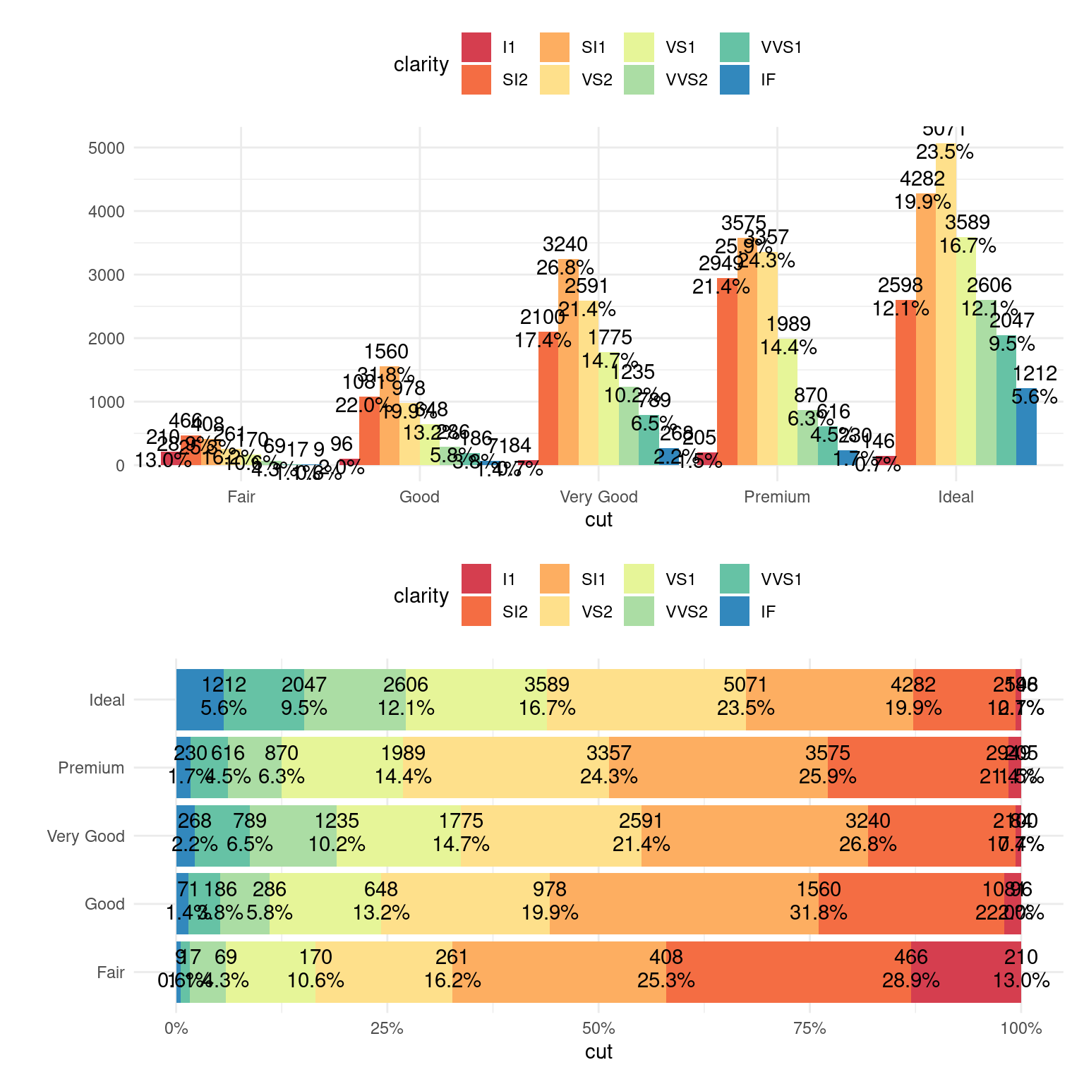
图 12.30: 添加注释到条形图
借助 plotly 制作相应的动态百分比堆积条形图
ggplot(data = diamonds, aes(x = cut, fill = clarity)) +
  geom_bar(position = "dodge2") +
  scale_fill_brewer(palette = "Spectral")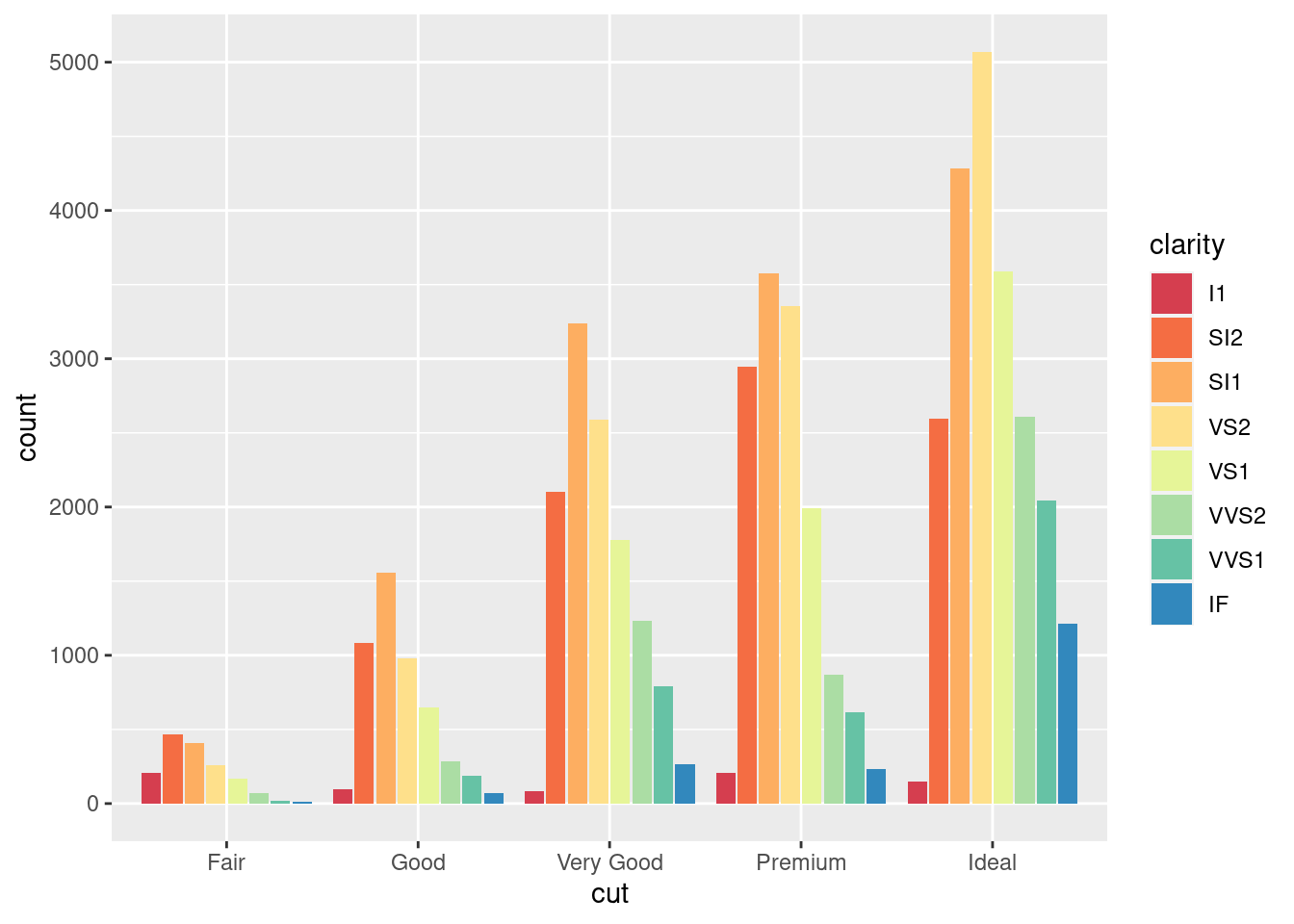
图 12.31: 百分比堆积条形图
# 百分比堆积条形图
plotly::plot_ly(dat,
  x = ~cut, color = ~clarity, y = ~pct,
  colors = "Spectral", type = "bar",
  text = ~ paste0(
    cnt, "颗 <br>",
    "占比:", scales::percent(pct, accuracy = 0.1), "<br>"
  ),
  hoverinfo = "text"
) %>%
  plotly::layout(
    barmode = "stack",
    yaxis = list(tickformat = ".0%")
  ) %>%
  plotly::config(displayModeBar = FALSE)
图 12.31: 百分比堆积条形图
# `type = "histogram"` 以 cut 和 clarity 分组计数
plotly::plot_ly(diamonds,
  x = ~cut, color = ~clarity,
  colors = "Spectral", type = "histogram"
) %>%
  plotly::config(displayModeBar = FALSE)
图 12.31: 百分比堆积条形图
# 堆积图
plotly::plot_ly(diamonds,
  x = ~cut, color = ~clarity,
  colors = "Spectral", type = "histogram"
) %>%
  plotly::layout(
    barmode = "stack",
    yaxis = list(title = "cnt"),
    legend = list(title = list(text = "clarity"))
  ) %>%
  plotly::config(displayModeBar = FALSE)
图 12.31: 百分比堆积条形图