12.4 散点图
下面以 diamonds 数据集为例展示 ggplot2 的绘图过程,首先加载 diamonds 数据集,查看数据集的内容
data(diamonds)
str(diamonds)
## tibble [53,940 × 10] (S3: tbl_df/tbl/data.frame)
## $ carat : num [1:53940] 0.23 0.21 0.23 0.29 0.31 0.24 0.24 0.26 0.22 0.23 ...
## $ cut : Ord.factor w/ 5 levels "Fair"<"Good"<..: 5 4 2 4 2 3 3 3 1 3 ...
## $ color : Ord.factor w/ 7 levels "D"<"E"<"F"<"G"<..: 2 2 2 6 7 7 6 5 2 5 ...
## $ clarity: Ord.factor w/ 8 levels "I1"<"SI2"<"SI1"<..: 2 3 5 4 2 6 7 3 4 5 ...
## $ depth : num [1:53940] 61.5 59.8 56.9 62.4 63.3 62.8 62.3 61.9 65.1 59.4 ...
## $ table : num [1:53940] 55 61 65 58 58 57 57 55 61 61 ...
## $ price : int [1:53940] 326 326 327 334 335 336 336 337 337 338 ...
## $ x : num [1:53940] 3.95 3.89 4.05 4.2 4.34 3.94 3.95 4.07 3.87 4 ...
## $ y : num [1:53940] 3.98 3.84 4.07 4.23 4.35 3.96 3.98 4.11 3.78 4.05 ...
## $ z : num [1:53940] 2.43 2.31 2.31 2.63 2.75 2.48 2.47 2.53 2.49 2.39 ...数值型变量 carat 作为 x 轴
ggplot(diamonds, aes(x = carat))
ggplot(diamonds, aes(x = carat, y = price))
ggplot(diamonds, aes(x = carat, color = cut))
ggplot(diamonds, aes(x = carat), color = "steelblue")
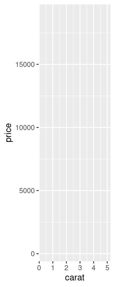

图 12.6: 绘图过程
图 12.6 的基础上添加数据图层
sub_diamonds <- diamonds[sample(1:nrow(diamonds), 1000), ]
ggplot(sub_diamonds, aes(x = carat, y = price)) +
  geom_point()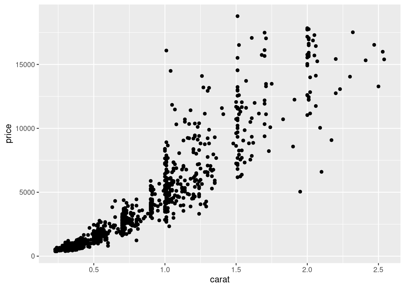
图 12.7: 添加数据图层
给散点图12.7上色
ggplot(sub_diamonds, aes(x = carat, y = price)) +
  geom_point(color = "steelblue")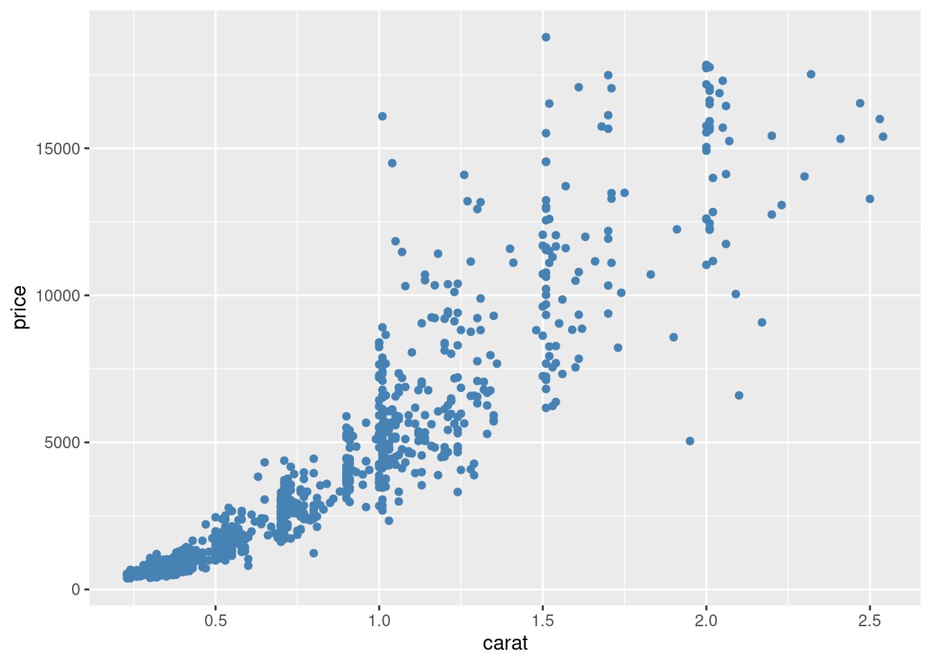
图 12.8: 散点图配色
ggplot(sub_diamonds, aes(x = carat, y = price)) +
  geom_point(color = "steelblue") +
  scale_y_continuous(
    labels = scales::unit_format(unit = "k", scale = 1e-3),
    breaks = seq(0, 20000, 4000)
  )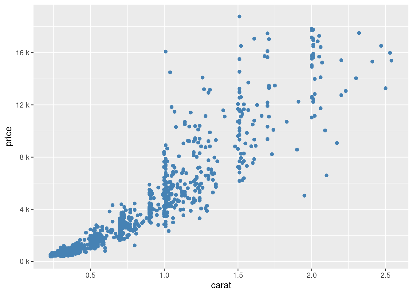
图 12.9: 格式化坐标轴刻度标签
让另一变量 cut 作为颜色分类指标
ggplot(sub_diamonds, aes(x = carat, y = price, color = cut)) +
  geom_point()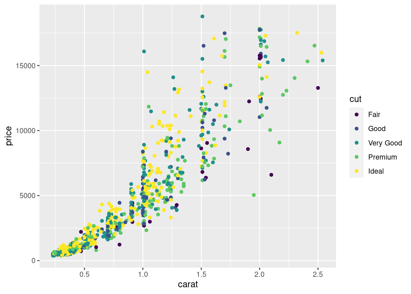
图 12.10: 分类散点图
当然还有一种类似的表示就是分组,默认情况下,ggplot2将所有观测点视为一组,以分类变量 cut 来分组
ggplot(sub_diamonds, aes(x = carat, y = price, group = cut)) +
  geom_point()
图 12.11: 分组
在图12.11 上没有体现出来分组的意思,下面以 cut 分组线性回归为例
ggplot(sub_diamonds, aes(x = carat, y = price)) +
  geom_point() +
  geom_smooth(method = "lm")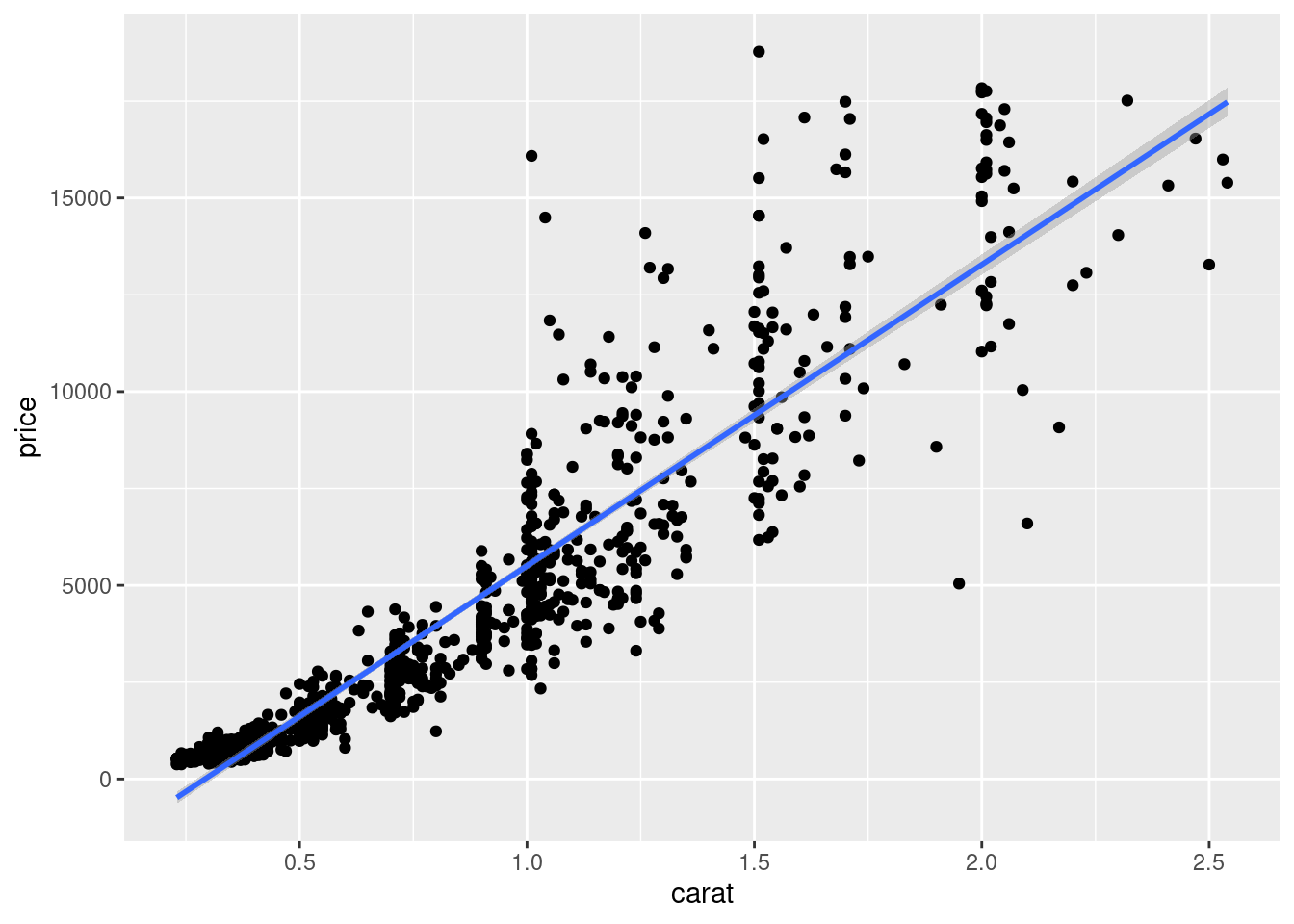
图 12.12: 分组线性回归
ggplot(sub_diamonds, aes(x = carat, y = price, group = cut)) +
  geom_point() +
  geom_smooth(method = "lm")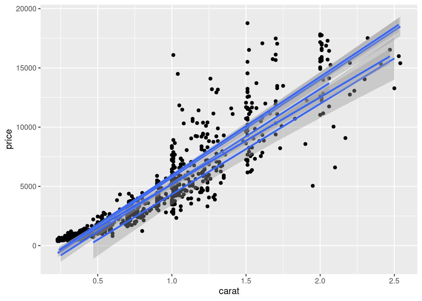
图 12.13: 分组线性回归
我们当然可以选择更加合适的拟合方式,如局部多项式平滑 loess 但是该方法不太适用观测值比较多的情况,因为它会占用比较多的内存,建议使用广义可加模型作平滑拟合
ggplot(sub_diamonds, aes(x = carat, y = price, group = cut)) +
  geom_point() +
  geom_smooth(method = "loess")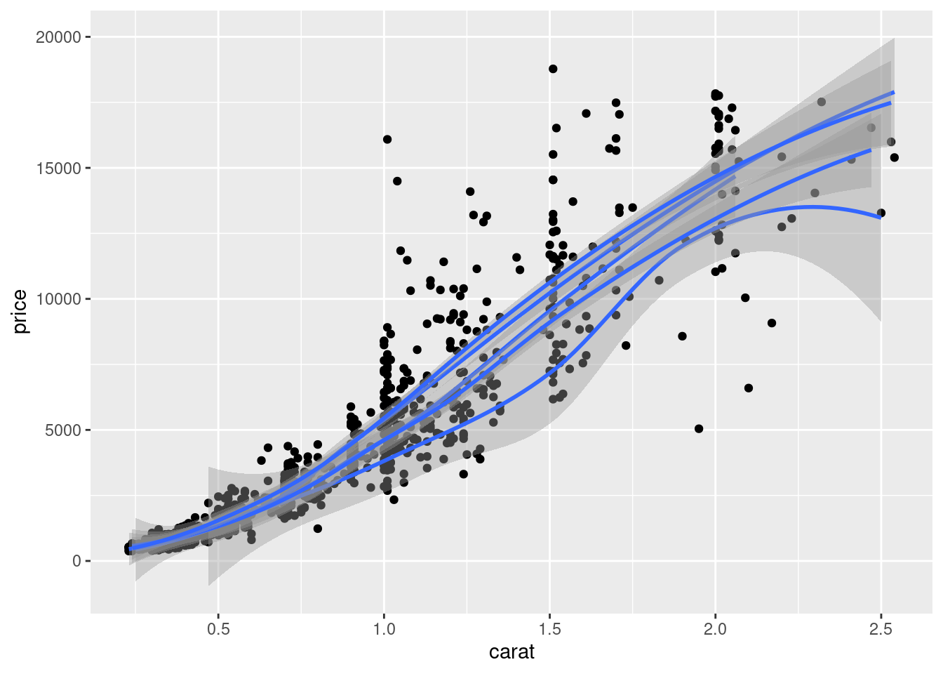
图 10.7: 局部多项式平滑
ggplot(sub_diamonds, aes(x = carat, y = price, group = cut)) +
  geom_point() +
  geom_smooth(method = "gam", formula = y ~ s(x, bs = "cs"))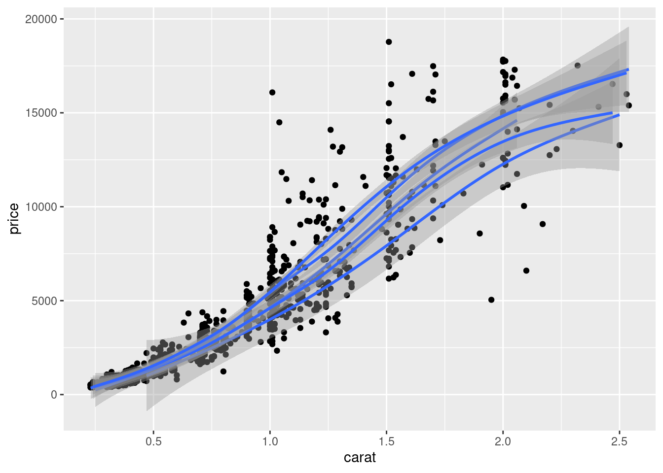
图 12.14: 数据分组应用广义可加平滑
ggfortify 包支持更多的统计分析结果的可视化。
为了更好地区分开组别,我们在图12.14的基础上分面或者配色
ggplot(sub_diamonds, aes(x = carat, y = price, group = cut)) +
  geom_point() +
  geom_smooth(method = "gam", formula = y ~ s(x, bs = "cs")) +
  facet_grid(~cut)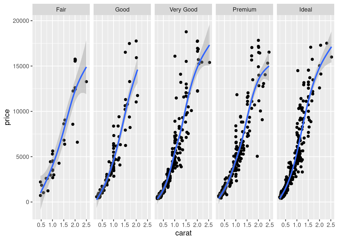
图 12.15: 分组分面
ggplot(sub_diamonds, aes(x = carat, y = price, group = cut, color = cut)) +
  geom_point() +
  geom_smooth(method = "gam", formula = y ~ s(x, bs = "cs"))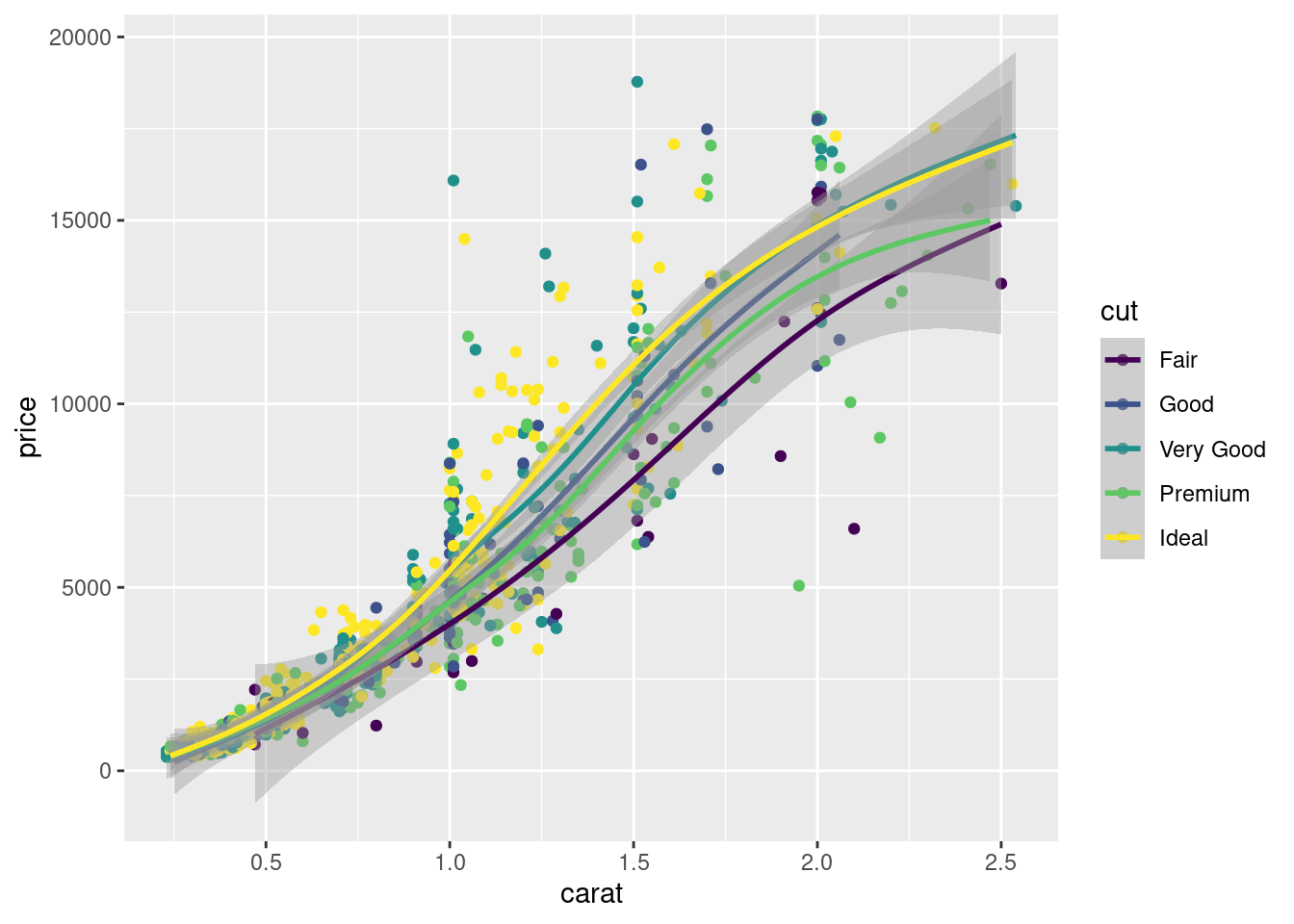
图 12.16: 分组配色
在分类散点图的另一种表示方法就是分面图,以 cut 变量作为分面的依据
ggplot(sub_diamonds, aes(x = carat, y = price)) +
  geom_point() +
  facet_grid(~cut)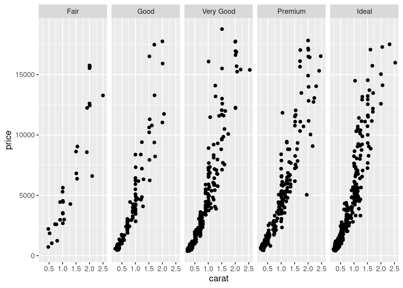
图 12.17: 分面散点图
给图 12.17 上色
ggplot(sub_diamonds, aes(x = carat, y = price)) +
  geom_point(color = "steelblue") +
  facet_grid(~cut)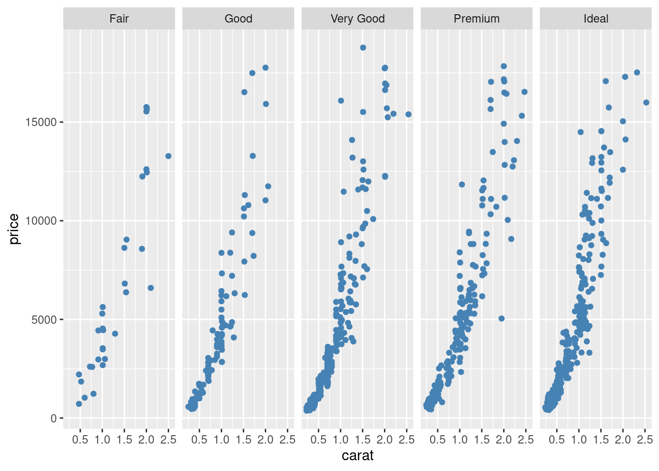
图 12.18: 给分面散点图上色
在图12.18的基础上,给不同的类上不同的颜色
ggplot(sub_diamonds, aes(x = carat, y = price, color = cut)) +
  geom_point() +
  facet_grid(~cut)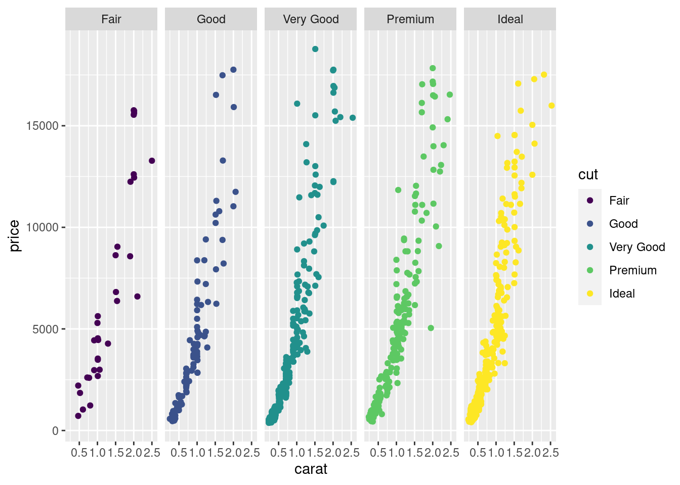
图 12.19: 给不同的类上不同的颜色
去掉图例,此时图例属于冗余信息了
ggplot(sub_diamonds, aes(x = carat, y = price, color = cut)) +
  geom_point(show.legend = FALSE) +
  facet_grid(~cut)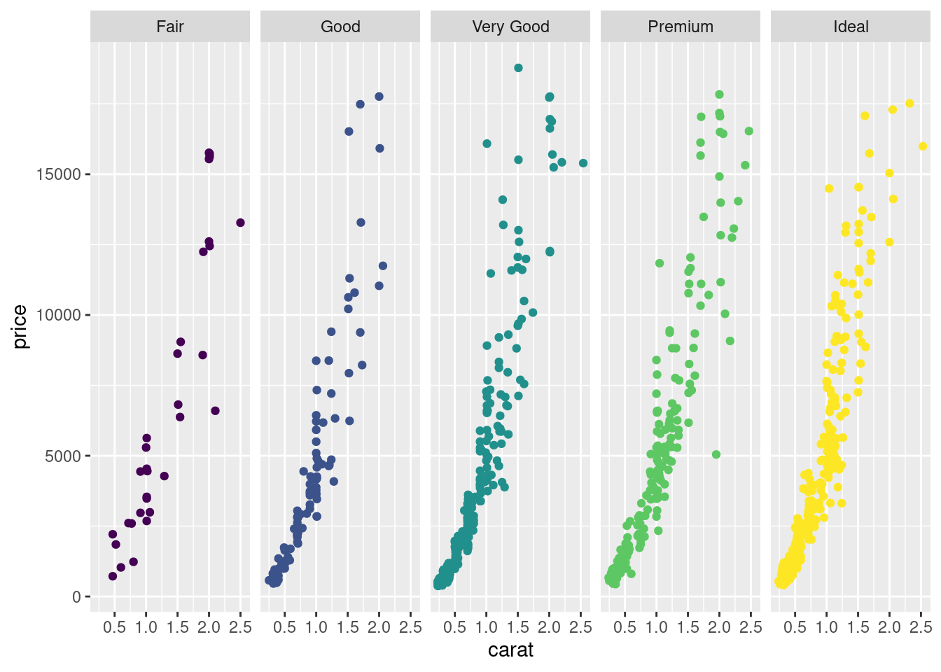
图 12.20: 去掉图例
四块土地,所施肥料不同,肥力大小顺序 4 < 2 < 3 < 1 小麦产量随肥力的变化
data(Wheat2, package = "nlme") # Wheat Yield Trials
library(colorspace)
ggplot(Wheat2, aes(longitude, latitude)) +
  geom_point(aes(size = yield, colour = Block)) +
  scale_color_discrete_sequential(palette = "Viridis") +
  scale_x_continuous(breaks = seq(0, 30, 5)) +
  scale_y_continuous(breaks = seq(0, 50, 10))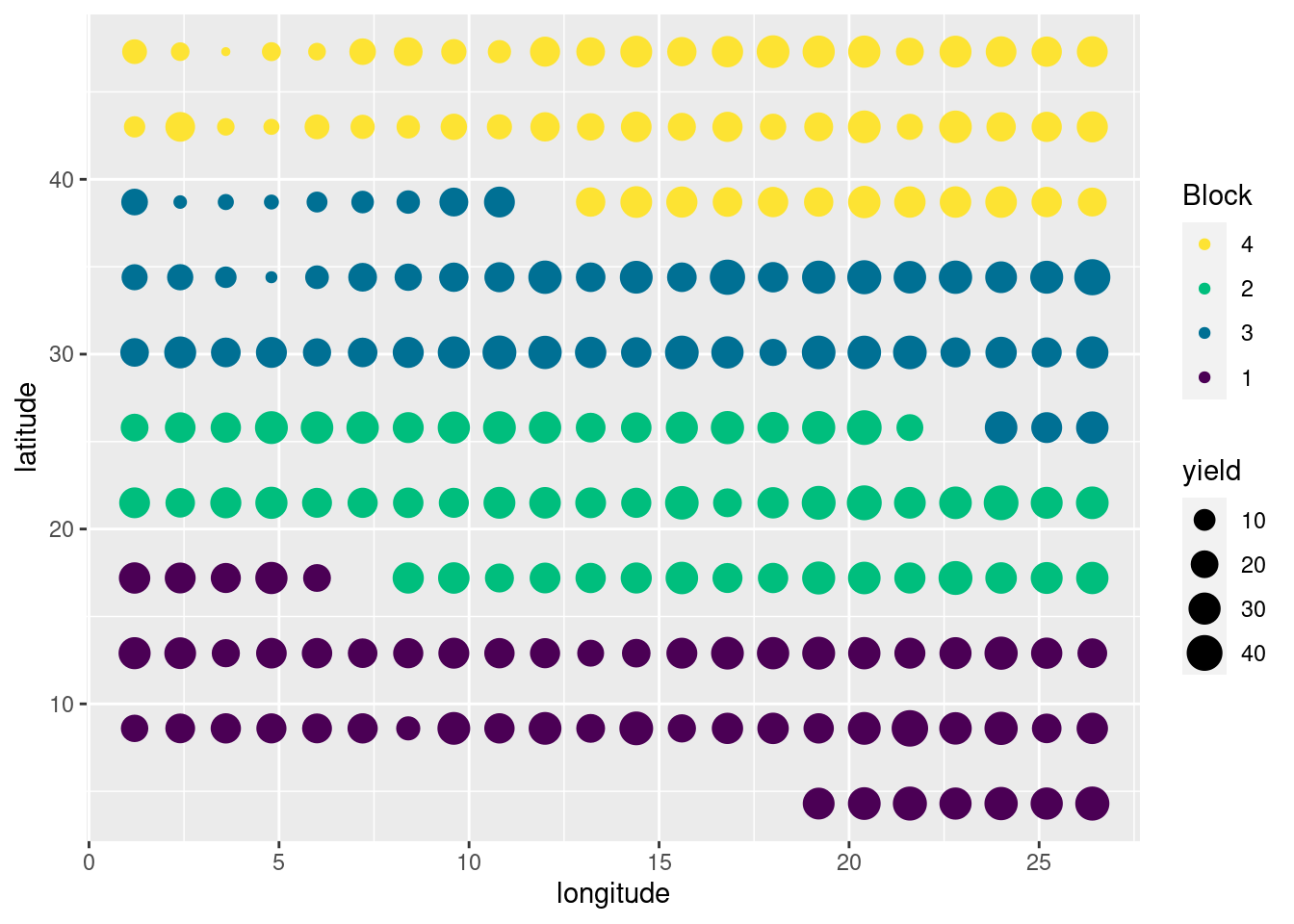
图 10.8: 多个图例
ggplot(mtcars, aes(x = hp, y = mpg, color = factor(am))) +
  geom_point()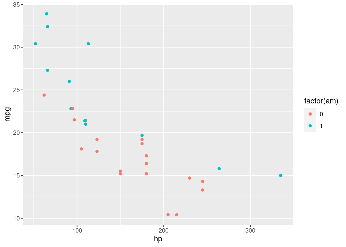
图 12.21: 分类散点图
图层、分组、分面和散点图介绍完了,接下来就是其它统计图形,如箱线图,小提琴图和条形图
dat <- as.data.frame(cbind(rep(1948 + seq(12), each = 12), rep(seq(12), 12), AirPassengers))
colnames(dat) <- c("year", "month", "passengers")

ggplot(data = dat, aes(x = as.factor(year), y = as.factor(month))) +
  stat_sum(aes(size = passengers), colour = "lightblue") +
  scale_size(range = c(1, 10), breaks = seq(100, 650, 50)) +
  labs(x = "Year", y = "Month", colour = "Passengers") +
  theme_minimal()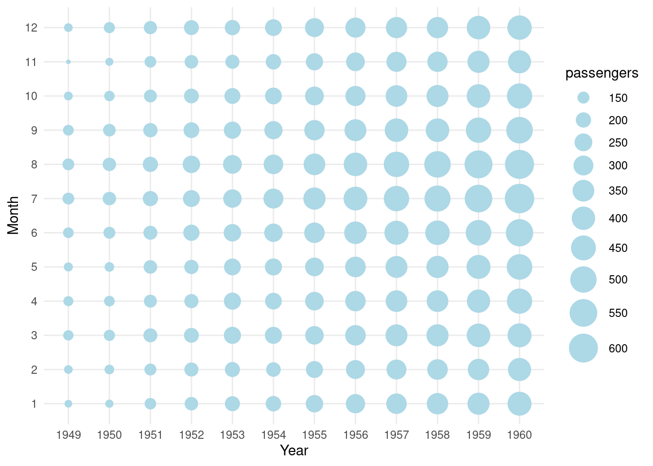
图 12.22: 1948年至1960年航班乘客人数变化