12.7 箱线图
以 PlantGrowth 数据集为例展示箱线图,在两组不同实验条件下,植物生长的情况,纵坐标是干燥植物的量,横坐标表示不同的实验条件。这是非常典型的适合用箱线图来表达数据的场合,Y 轴对应数值型变量,X 轴对应分类变量,在 R 语言中,分类变量的类型是 factor
data("PlantGrowth")
str(PlantGrowth)
## 'data.frame': 30 obs. of 2 variables:
## $ weight: num 4.17 5.58 5.18 6.11 4.5 4.61 5.17 4.53 5.33 5.14 ...
## $ group : Factor w/ 3 levels "ctrl","trt1",..: 1 1 1 1 1 1 1 1 1 1 ...ggplot(data = PlantGrowth, aes(x = group, y = weight)) + geom_boxplot()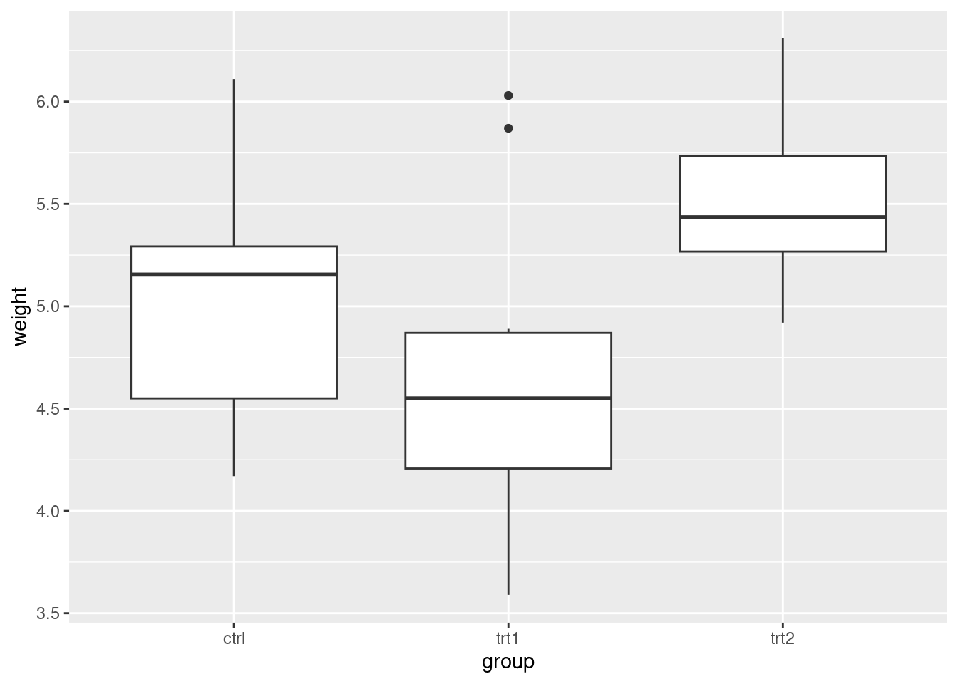
PlantGrowth 数据量比较小,此时比较适合采用抖动散点图,抖动是为了避免点之间相互重叠,为了增加不同类别之间的识别性,我们可以用不同的点的形状或者不同的颜色来表示类别
ggplot(data = PlantGrowth, aes(x = group, y = weight, shape = group)) + geom_jitter()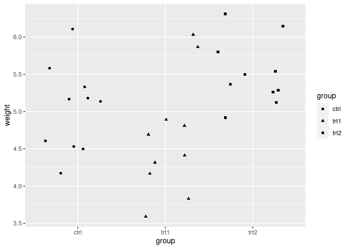
ggplot(data = PlantGrowth, aes(x = group, y = weight, color = group)) + geom_jitter()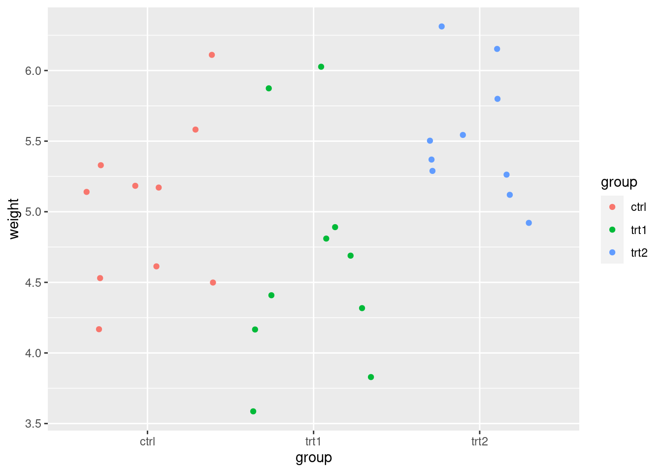
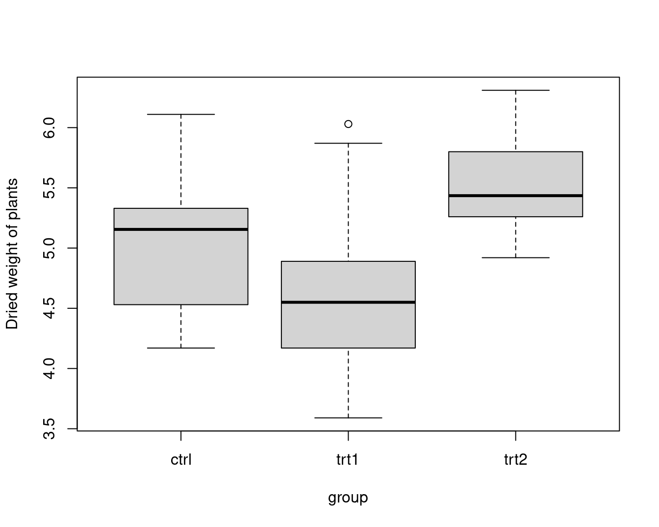
boxplot(weight ~ group,
  data = PlantGrowth,
  ylab = "Dried weight of plants", col = "lightgray",
  notch = FALSE, varwidth = TRUE
)
以钻石切割质量 cut 为分面依据,以钻石颜色类别 color 为 x 轴,钻石价格为 y 轴,绘制箱线图12.34
ggplot(diamonds, aes(x = color, y = price, color = cut)) +
  geom_boxplot(show.legend = FALSE) +
  facet_grid(~cut)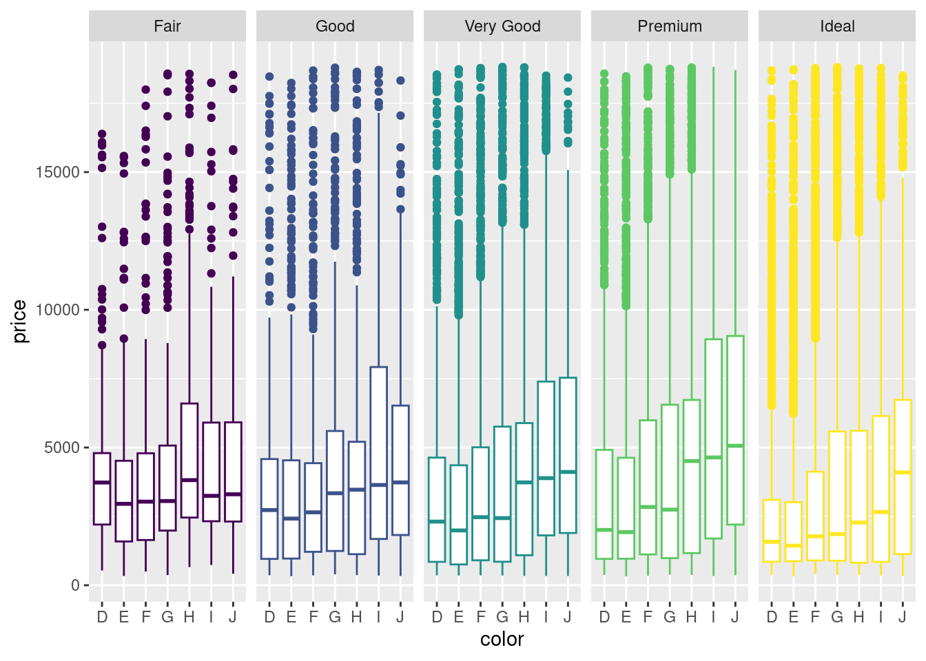
图 12.34: 箱线图
我们当然还可以添加钻石的纯净度 clarity 作为分面依据,那么箱线图可以为图 12.35
ggplot(diamonds, aes(x = color, y = price, color = cut)) +
  geom_boxplot(show.legend = FALSE) +
  facet_grid(clarity ~ cut)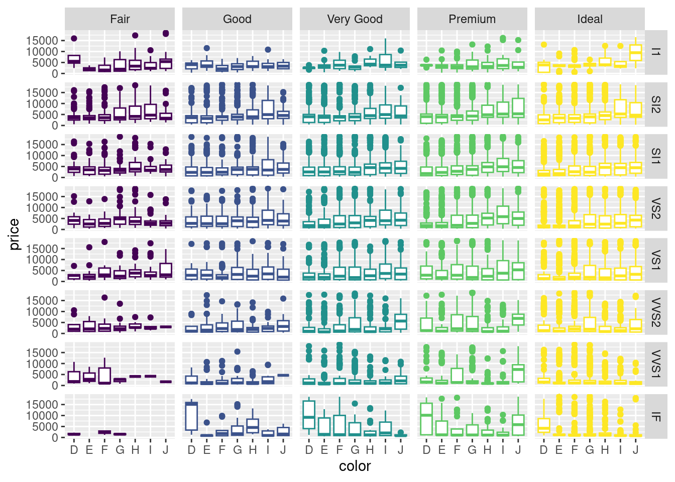
图 12.35: 复合分面箱线图
经过观察,我们发现水平分类过多,考虑用切割质量 cut 替换钻石颜色 color 绘图,但是由于分类过细,图信息展示不简练,反而不好,如图 12.36
ggplot(diamonds, aes(x = cut, y = price, color = cut)) +
  geom_boxplot(show.legend = FALSE) +
  facet_grid(clarity ~ color)
ggplot(diamonds, aes(x = cut, y = price, color = color)) +
  geom_boxplot(show.legend = FALSE) +
  facet_grid(clarity ~ color)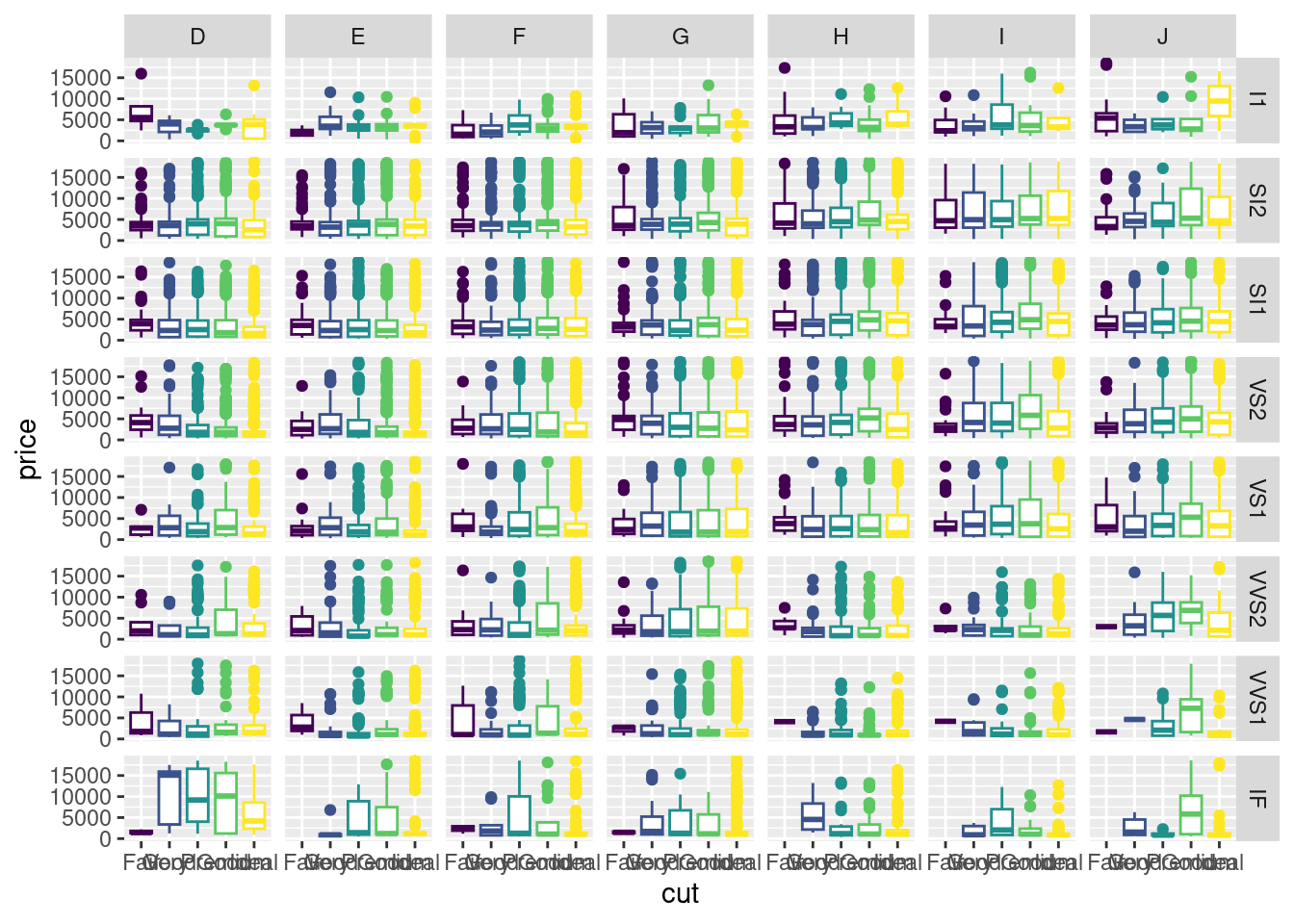
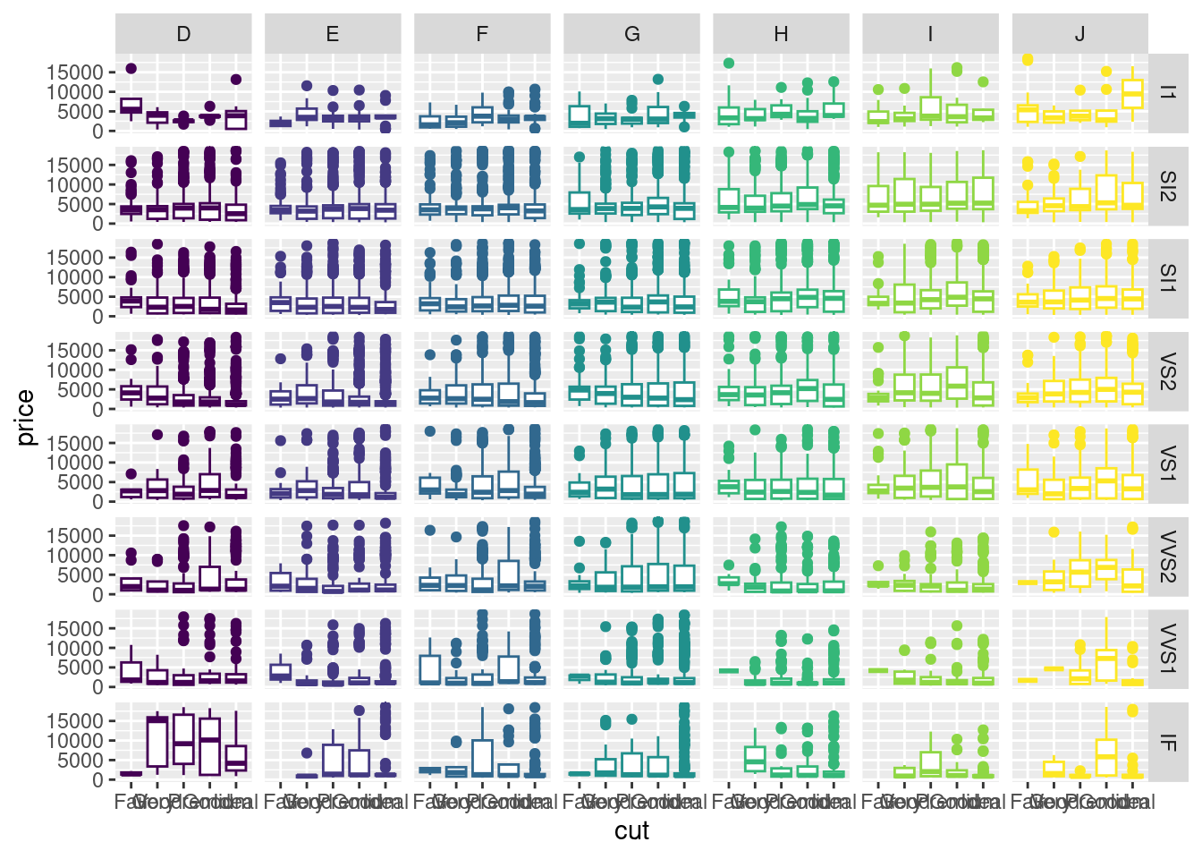
图 12.36: 箱线图配色